

Introduction
Hi, my name is Johan Vikstrom, I'm a senior 3D artist and have 16 years experience at Swiss International AB in Stockholm Sweden. I've also worked on the last Harry Potter movie for MPC in 2011 as a compositor. I've worked most of my career as a generalist doing a bit of everything. The last 5-6 years I've mostly been specializing in lookdev / lighting / compositing, which is the part of the vfx production I enjoy working on the most. I've always had a passion for digital humans, which I will continue to improve my skills doing.
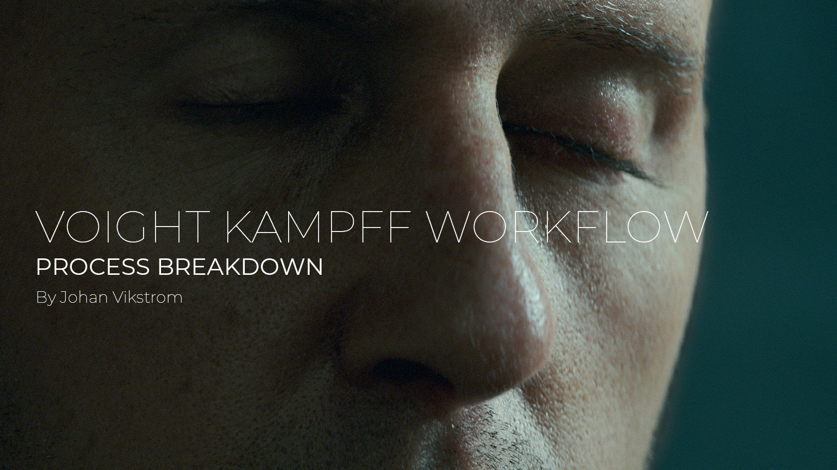
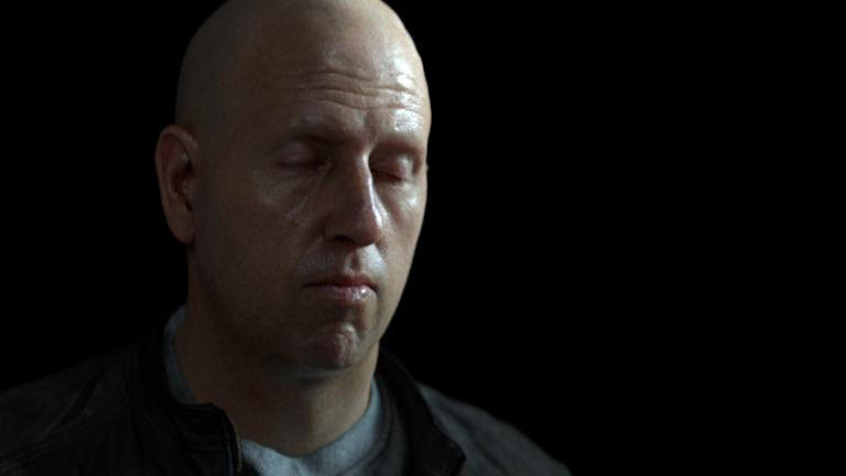
I was asked by 3D Scan Store to do a breakdown of the "Voight Kampff" image I did with their free scan model. So here is a breakdown of my proccess of making a photorealistic image.
Download Head Scan Source Files
The tools I'm using are Maya, V-ray, Yeti, Mudbox and Nuke, so this guide will cover how they are used. But other tools can do similar operations, just in a different way of course. This breakdown requires that you have good basic 3D lighting / compositing knowledge and some experience with rendering digital humans. The wikihuman resource is a great asset to get into this subject: https://vgl.ict.usc.edu/Data/DigitalEmily2/
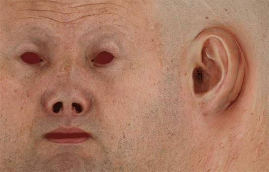
Final Project Renders
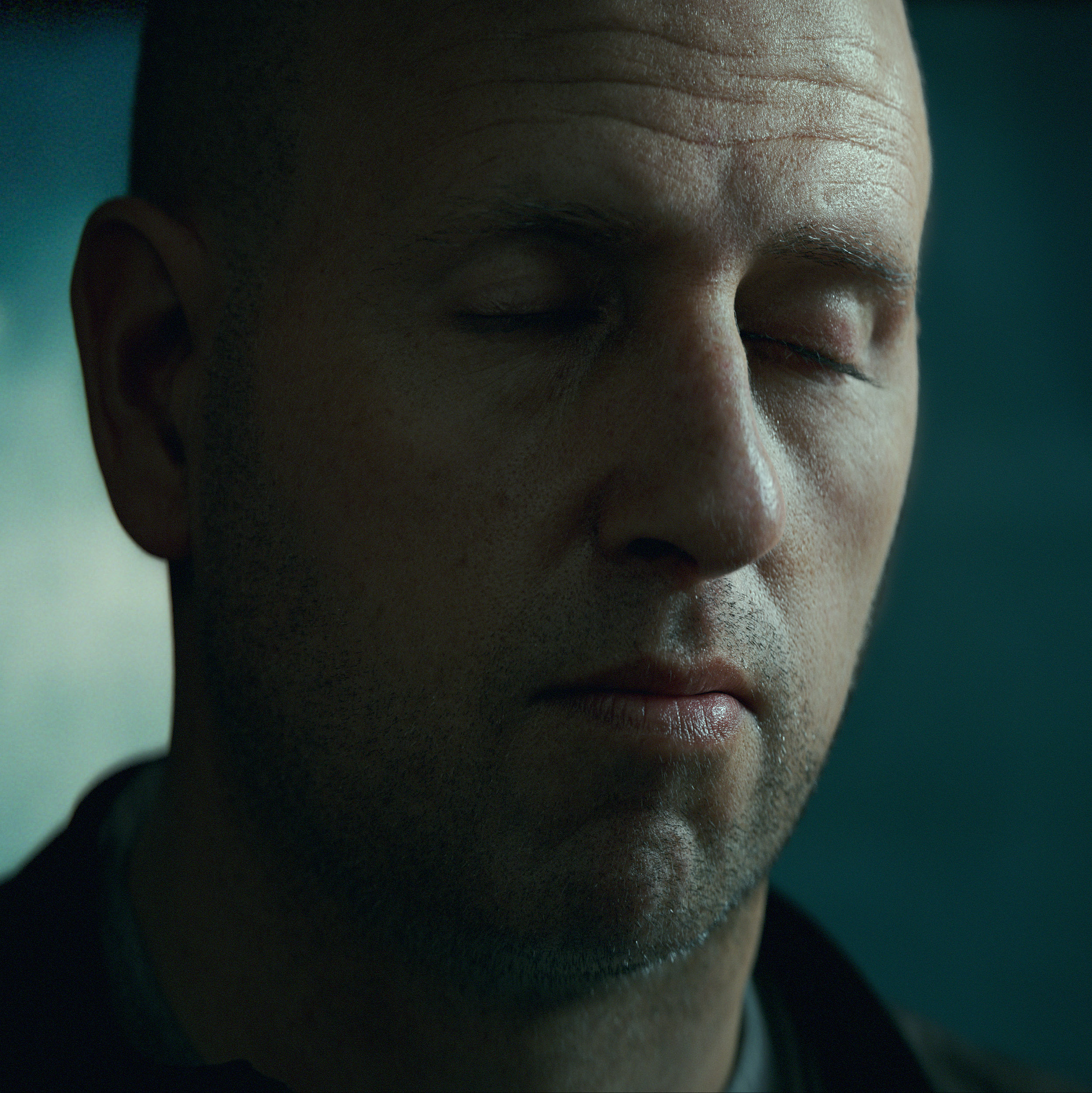 |
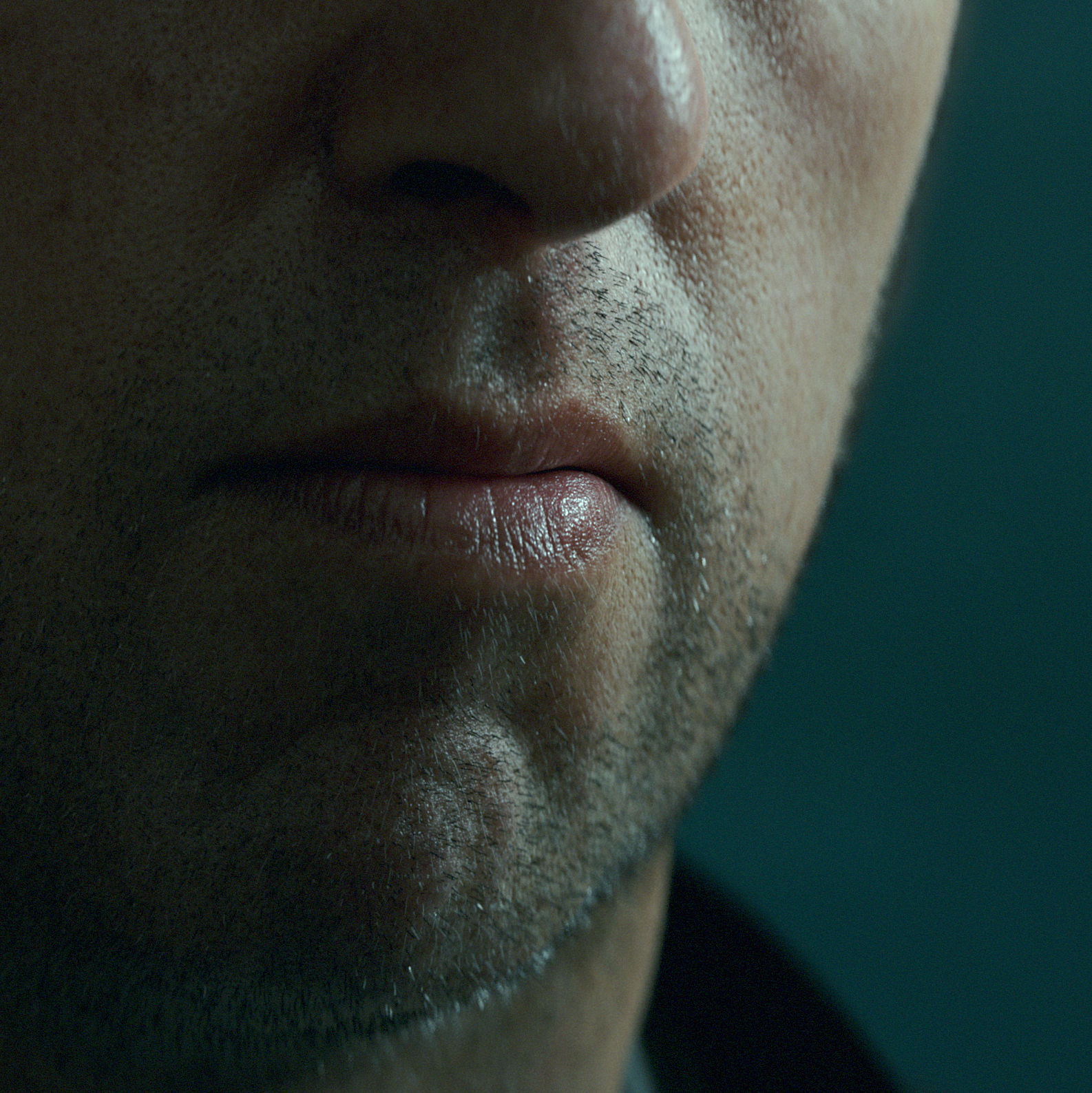 |
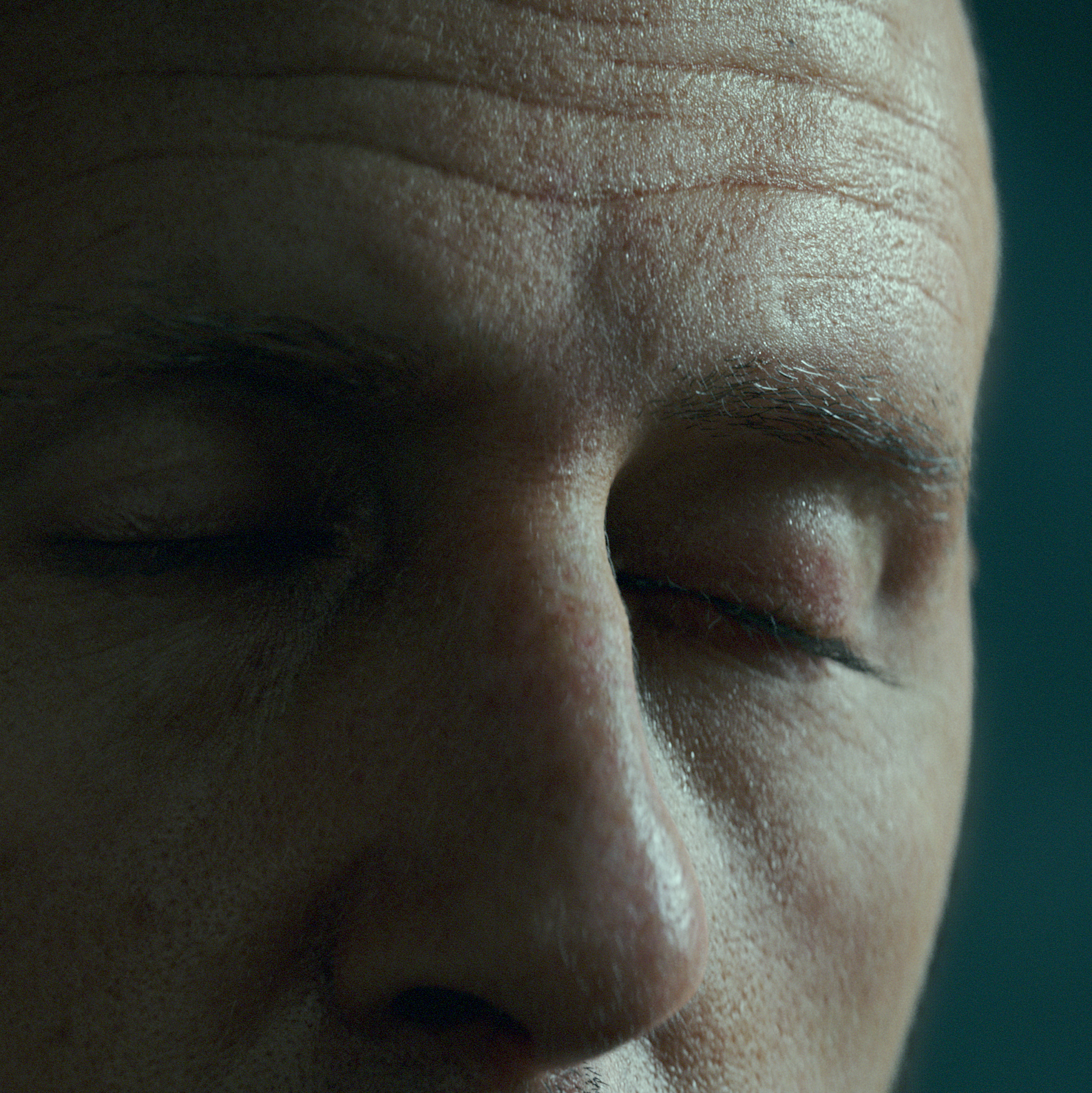 |
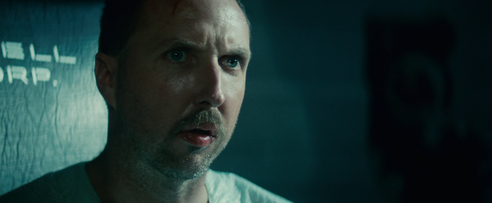
Reference
Human skin is extremely complex to mimic, so a lot of references are needed. In fact most hollywood productions have standin people for skin / lighting references in the shots. So if you're going to light a photorealistic human I would recommend choosing a picture of a real person to use as your reference. In this way you will have something to look at to see what is correct and what is not.
For my reference I used this shot from Blade Runner 1982.
Camera
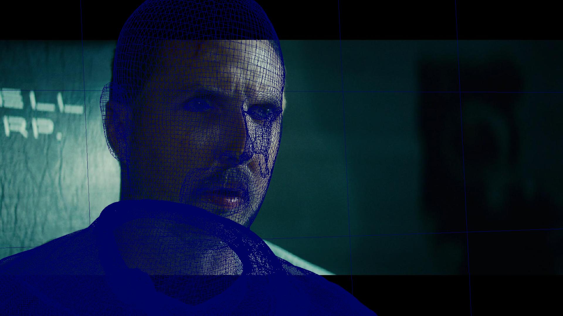
My first step is determining what camera was used. Ideally you need to know the filmback, focal length and F-stop of the camera that was used to match it 100%. If this type of information is not available it's not that big of a deal. You can always try to reverse engineer the camera by placing things in frame and see if they line up with objects in the picture. Tweaking the focal length back and forth until you get a match. Tracking softwares can calculate a good guess for you if you give them some lines in the picture also.
For lenses I know they worked mostly with 100+ mm lenses from the behind the scenes films. So I guessed 100mm for this shot and probably a 2.0 - 2.8 F-stop. The lowerer the F-stop the more depth of field you will have. I ended up using 2.0 F-stop for my picture, which gives you a very narrow focus area. In hindsight I think the shot used 2.8, but I messed up the camera / focal point or pose a bit so with 2.8 his ears was still looking in focus, so that's why I needed up with 2.0
To add realism to your cg camera you need to add depth of field and you also need to add a bokeh map.
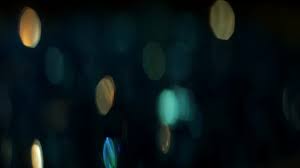
This helps bring realism to your final render, for this you need to attach a VrayPhysicalCamera and add an aperture map. They usually look something like this:
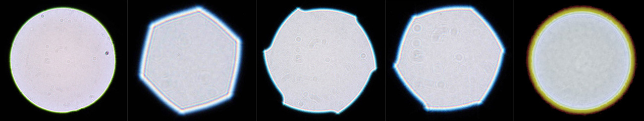
For my shot the camera used was anamorphic, but I actually used a normal round aperture map and then set the "bokeh anisotropy" in the VrayPhysicalCamera settings to -0.353. This will give you an anamorphic aperture map also. I also uncheck the "Affects exposure" so you don't have to compensate your light intensities to camera settings.
If you are interested in learning more about cameras you can find a ton on google, like: https://vfxcamdb.com/category/workflow/
Posing the character
When starting a scene it's important to think of the scale. Most highend production renderers use real world units for shader / light calculations. So everything in our scene needs to use the correct size, or as closely guessed as possible. 1 Maya unit should be 1 cm.
I tried to pose the scan model as closely as possible to the reference. You should be aware that any slight angle difference between your character and the reference will cause the specs to move to a different spot on the skin surface. Also if your 3d model does not match the actor in the reference picture, that will also cause this effect. So posing as accurately as possible will give you a smoother lighting process later on.
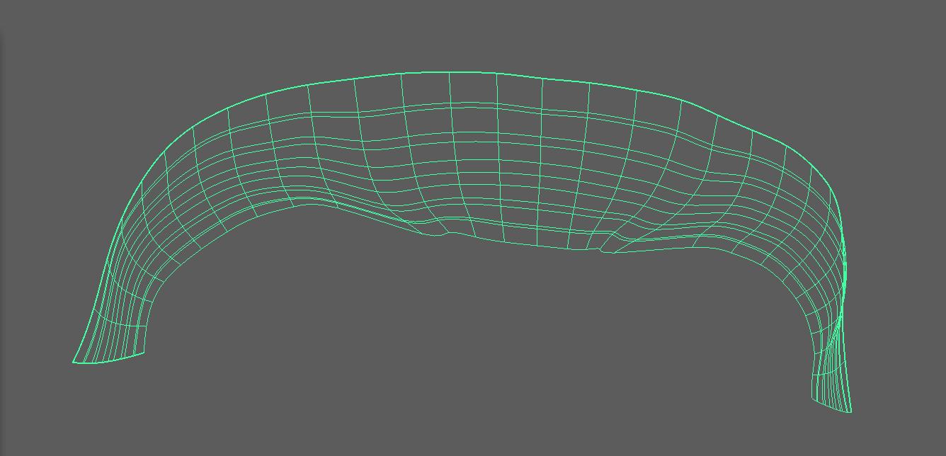
Shading the asset
3D Scan Store supplied a very clean scan and good diffuse texture so this part went quite smoothly. I use linux so I had to bring the model over to mudbox to be able to output a displacement map, as it's not supplied with the asset. For the diffuse texture I only removed the eyebrows from the texture to be able to add cg hair instead.
You also want to remove any SSS effects on the texture map, as this can cause glowing red areas in your render. The VrayAlSurface is fantastic at calculating accurate SSS. If you are painting your own texture you shouldn't paint SSS effects into your texture also. A simple grade node with a mask that removes red will solve this.
In the skinshader I used just a little bit of the normal map to bring a bit more detail into the mesh.
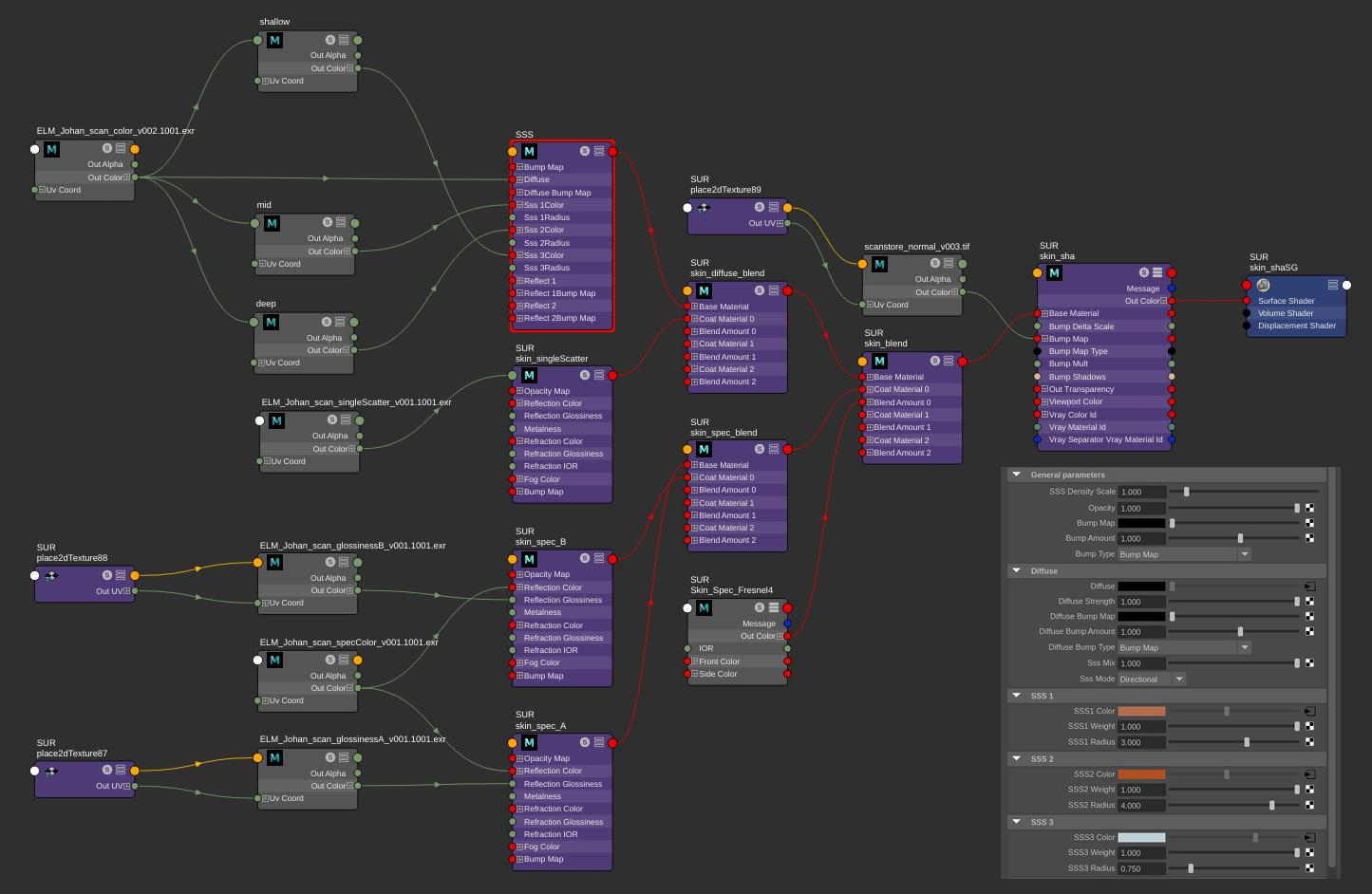
For specular color I used the cavity map with some grading to get some variations in the spec map.
I used glossiness maps but they actually do very little work in my spec setup. They could probably be removed all together. The spec shader consists of two blinn specular shaders, the glossiness of the sharper shader is 1, and the more diffuse spec shader is around 0.6-0.7. The roughness of the top layer of specular is instead controlled by the microdisplacement, this gives more accurate scattering of the specular on the skin.
To control the roughness of the specular I graded the microdisplacement to get the results I wanted, similar to how you grade the glossiness /roughness map.
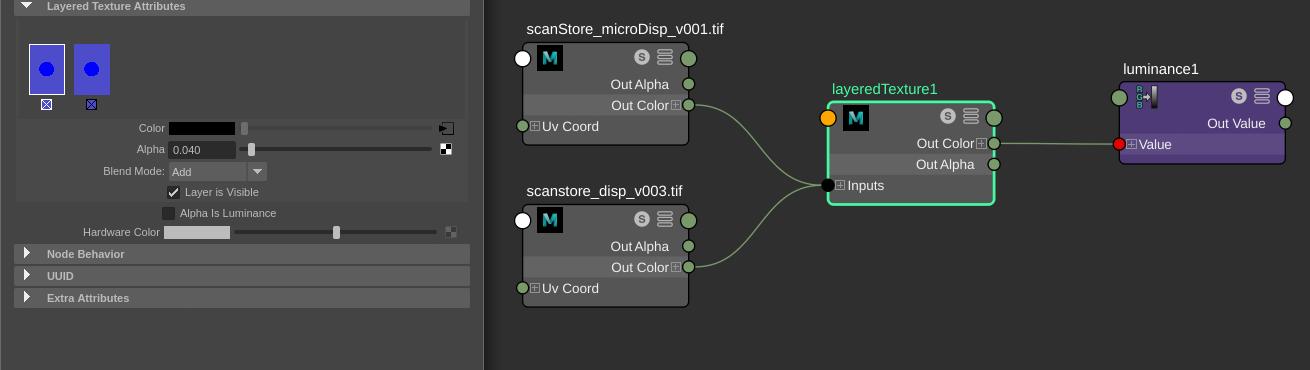
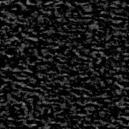
I add the microdisplacement on top of the normal displacement map. The layeredTexture controls the overall specular, for this image I used an add of 0.04. If I had used 0.02 he would of looked much more sweaty similar to the reference,. but I didn't want him too look that sweaty. Below is a render without microdisplacement so you get an idea of how much work the microdisplacement does to scatter the specs.
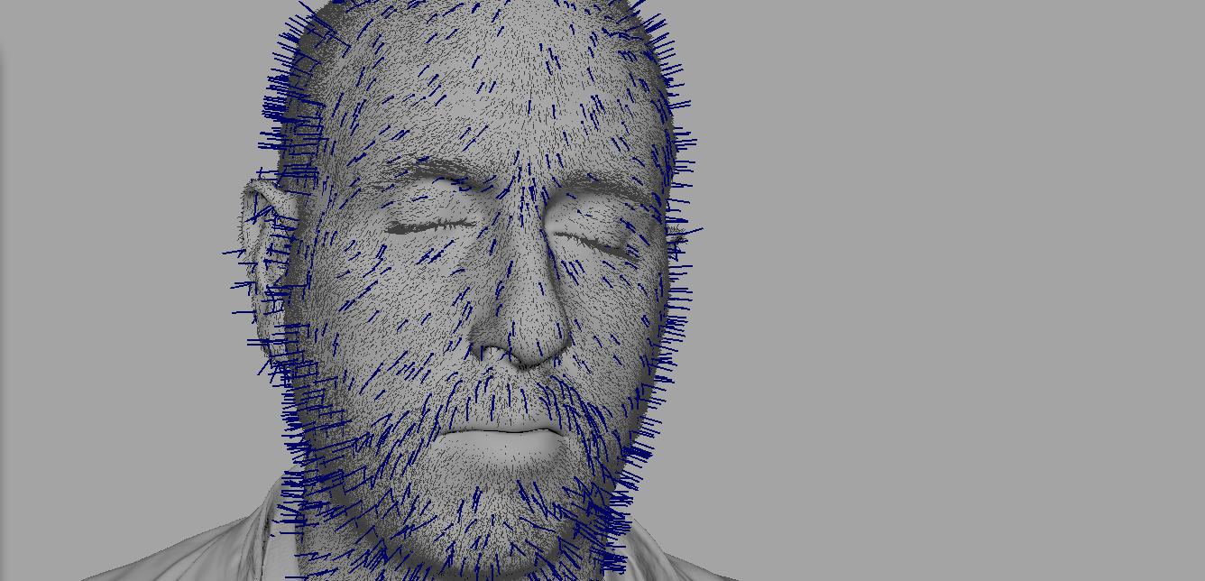
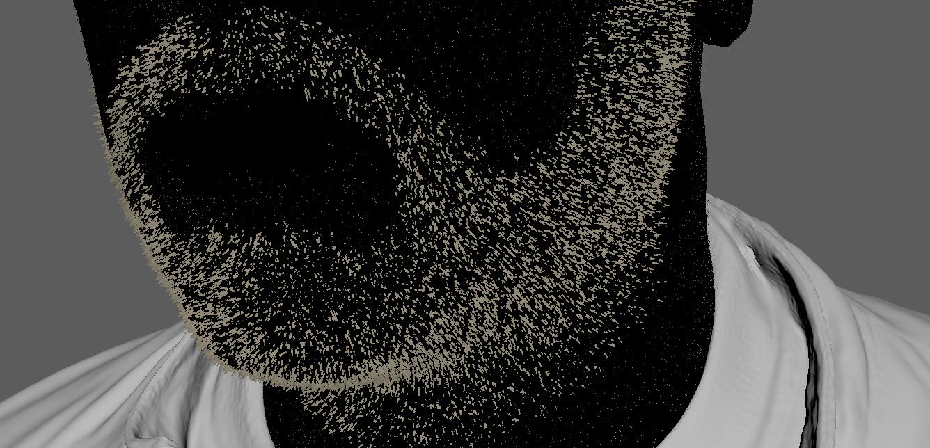
Grooming the asset
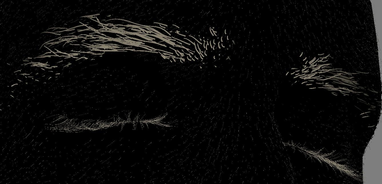
For grooming I used Peregrine Labs Yeti. For the eyelashes I used a curve setup I had from another asset. So I just tweaked and fitted the curves to this model and let yeti grow the hairs along the curves.
The peach fuzz hairs help a lot with breaking up the specular and giving you more realism.They actually take some very accurate grooming when your rendering in 5k resolution, so I did a few rerenders in the end where I found peach hairs going in the wrong direction.
The eyebrows was a bit of a special setup. I knew I was terrible at making eyebrows so I came up with a new idea of how to make them. I knew that I had a texture of the real eyebrows, so my idea was if I could draw curves on top of the real eyebrows I would get very accurate eyebrow guide curves. So I cropped out part of the mesh with only the polygons that has the eyebrows.
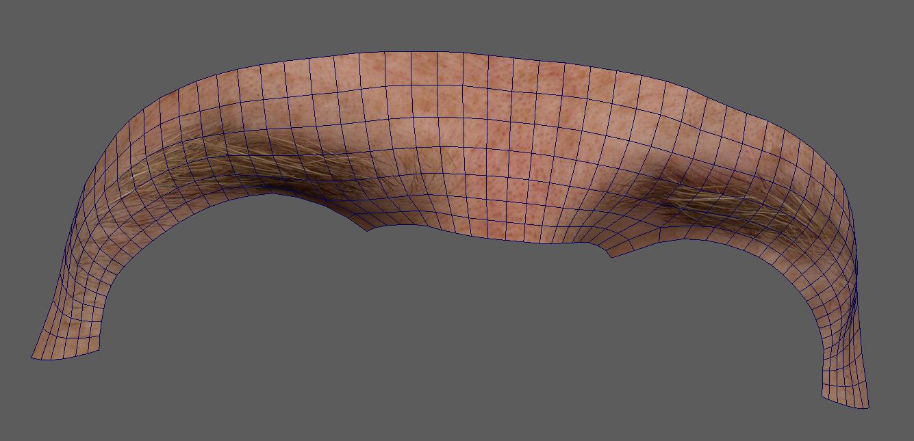
Then I converted all the vertical edges to curves and lofted a nurbs surface out of them.
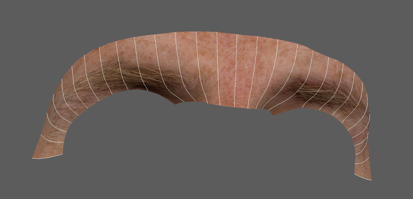
Why did I go through all this trouble you might ask. Well maya has this feature were you can draw curves on a surface, but that surface has to be nurbs. So after I made the nurbs surface I put a transparent shader on it so I can see the poly mesh with the texture behind it. And I lock the poly mesh in the display layer so I can't select it. Now I can paint curves on the nurbs surface while looking at the texture with the "Pencil Curve Tool".
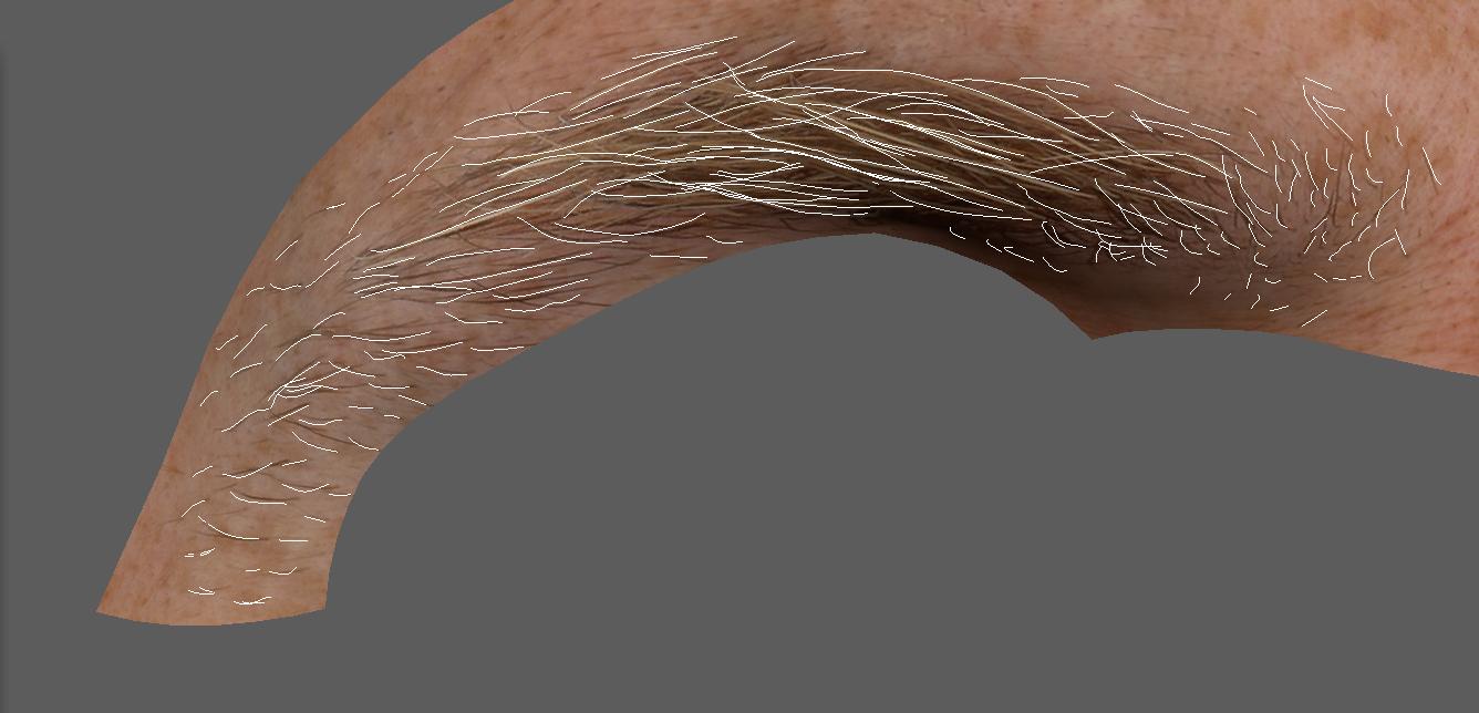
The curves need to be converted from surface curves to normal curves afterwards. And then you need to rebuild them to get less points on the curves. After that it's pretty straight forward to create the eyebrows from your very accurate guide curves. I made sure I had all the exact curves on the edges of the eyebrows, but didn't make every single hair in the thicker area. I used about 200 curves per eyebrow.
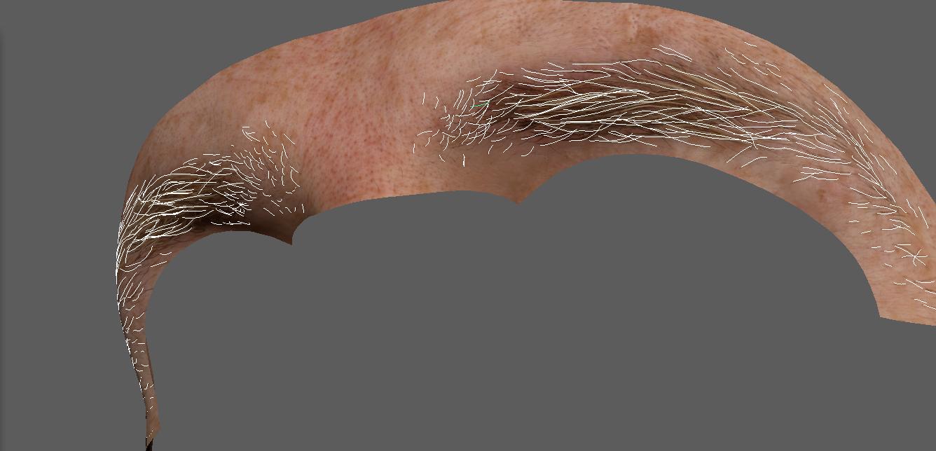
For the thicker parts of the eyebrows I used a density map to generate more hairs. You also need to pay attention to the direction your drawing your curves in, you need to start at the base of the hairstrand othervise you will change the hair direction
.
Since the curves are exactly on the surface and you want them to be slightly sticking out, you can control this in the Yeti graph by simply setting the guide node to be less than 100%. Also remember to add the displacement to the network so you don't end up with hairs behind the mesh. This also applies to the peach hairs. For head hair it's usually less important.
For the beard I just painted a density map and added a groom to control the direction of the hairs.
For the hair shaders I used VrayHairNext which is a really good shader for hair rendering. I didn't use any maps, I just played with the "Melanin" settings and tweaked the random settings until I had what I wanted in vrayRT.
Lighting
For lighting you want to think about the scale again. Where are lights placed in the scene, how far from the character are they? Where are they in relation to the camera? This will also help you bring more realism to the image.
When you work in a real production you will have access to the raw plate which is always best to work with. When you are working with a graded plate it can be a little trickier. You need to be aware that the grader can use keys and masks to control the lighting in different areas of the picture.
So maybe not all lighting you see in the picture was actually like that in the raw footage.
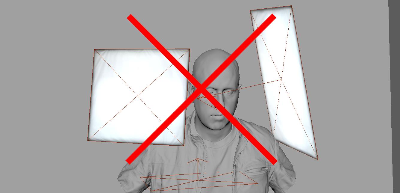
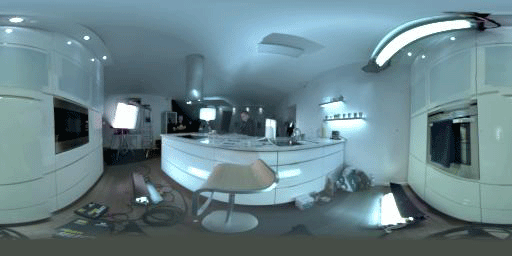
I started by picking an HDR, if you don't have an HDR from the actually set you can try to find something as similar as possible and then grade the HDR to match your reference. All lightsources needs to be remove from the HDR. You do this so you can have full control of all the lights in the render. So remove them in any photoediting software and save out a version which has only the set and no lights. In a real production you would want to crop out each light from the HDR and add them as an image to the lights in your lighting scene. This way you will get the most realistic results from your lighting. But since I'm are making a completely different lighting now I don't need to use any of the lights from this HDR.
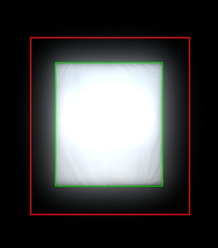
All lights in your 3D scene need a HDR light image applied to them, this adds a lot of realism to the lights reflection and lighting behavior. How the HDR is cropped also affects a lot how the light acts. You can either crop at the border of the light or crop further outside the light source to catch the flaring effect of the light. You also need to play with the directional attribute for the light to act correctly in the scene. Is it a focused light with flaps on the side or a softer light?
This flaring effect can look very good in eye reflections for example, and add a lot of realism. Another way is to turn off the reflections on the light and add a reflection card with the flaring instead. You can also used ramps to block of parts of a light.
In terms of your environment, you can choose to either model it or only use the HDR domelight. Which one you choose depends on how much light the environment casts on your subject. I opted to not model the environment for this project, mostly cause I knew the environment would be casting very little light / reflections in this scene. But it's a good thing to have your HDR mapped to an environment model, so the renderer knows the distance to objects. This way you will get correct reflections on your surfaces. A domelighting has inifite distance, so how will the renderer know if that white wall in the HDR is 100 meters away or 10 cm away from your character? Even a very simple model with planes and boxes will do a lot for your renders final quality.
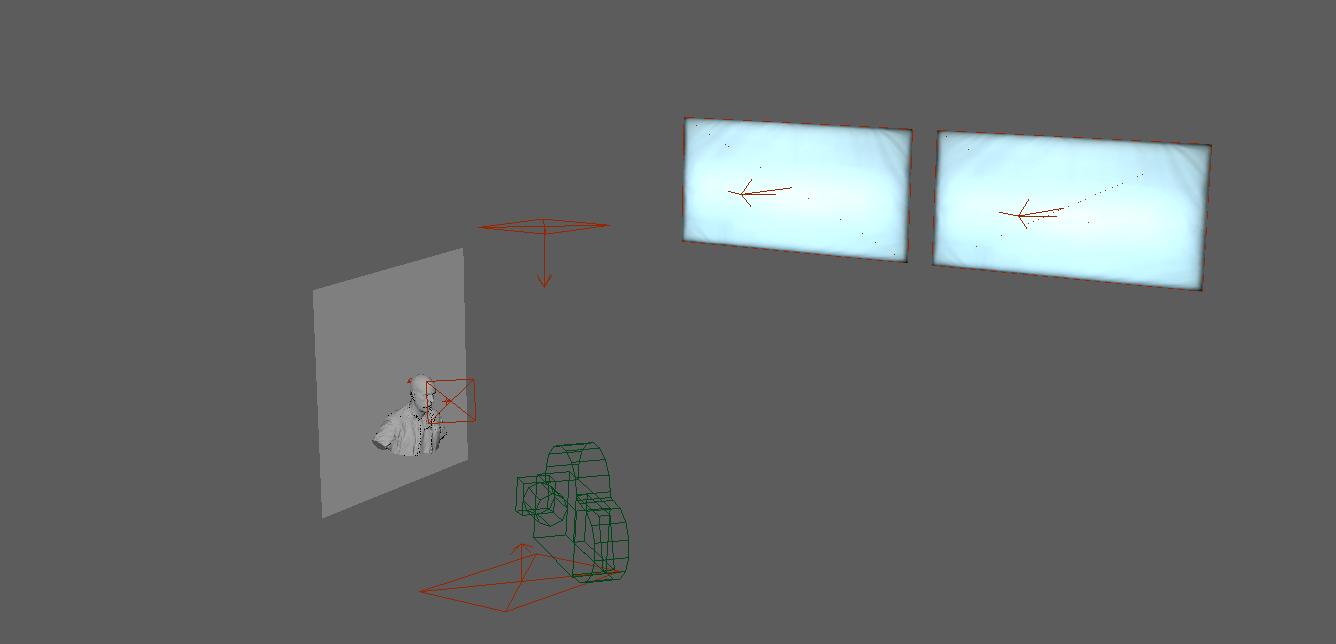
I used a dark plane behind him to block off any light coming from behind him in the HDR. In regards to lightblocking you should try to get in the mindset of a real lighter and how they handle lights and blocking. They use black curtains or black objects in the scene to block lights. So you can also use this method, just think of where you are putting your blockers so they are not visible in the camera, this also goes for lights. The lights shouldn't be visible in the camera, unless it's part of the image. Of course lights can be in the render and then removed in post in a real production. But be aware that it can cause an unrealistic effect that a trained eye can spot.
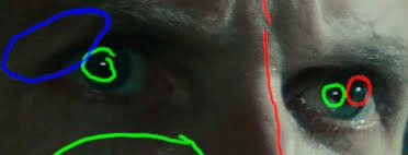
So let's analys the lighting for this shot. What you are looking for is where the light hits the skin surface, how the shadow falls and where the highlights are on the skin.
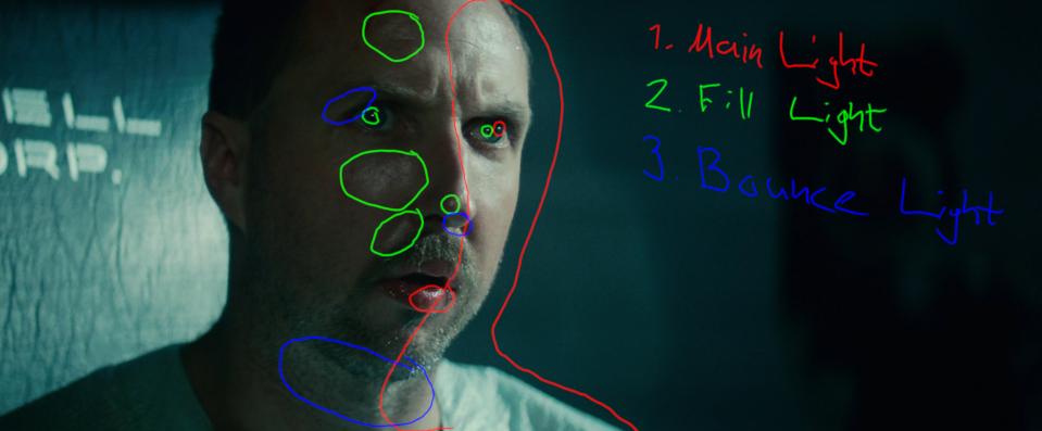
The eyes are also very good to see what kind of lights you can see reflecting in the eyes.
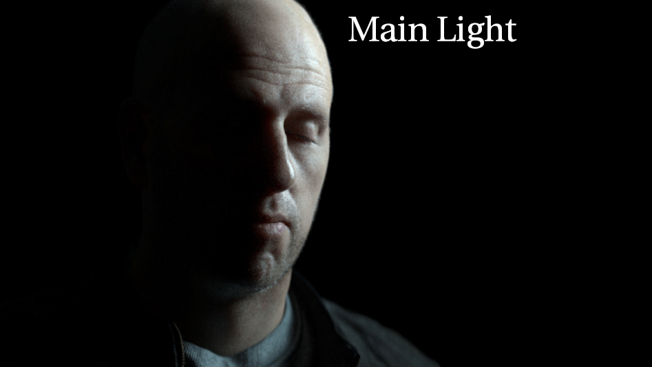
You have the main lights which are coming from the windows. If you study the shots from the movie you kinda get a sense of the distance and height they are at. When you are lighting it's a good rule of thumb to look at one light source at a time in a realtime render. Vray has vrayRT for this, so I can move the lights and look in realtime how only that light hits the surface.
If you look at the fill light you have a very strong reflection on the skin and in the eyes, but at the same time this part of the face is in shadow. They probably used a very strong but small light for this effect. But I opted to remove this as I didn't want him to look that sweaty, so I just went with a bigger softer light.
The bounce light I actually missunderstood and thought it was a lightsource under him. I was trying to a long time to find a spot for the light, so I would get the same reflection under his nose and chin as in the picture. In the end I realised this was actually his white shirt being reflected in the skin.
Since my character doesn't have a white shirt I don't get this effect. I kept the light but used a very low intensity, so it's barely visible in the render. Since I removed the strong reflection from the fill light I added a bit of top light to the scene to give some reflections to the darker parts of his face, so that area didn't look so flat.
You should try to mimic the light contrast of your render to the reference as closely as possible. This will give you less work in post when grading.
Compositing
This part of the process is probably the most important one. Here you can fix a lot of errors, you can also make big changes and then transfer them back to the asset for a smoother workflow.
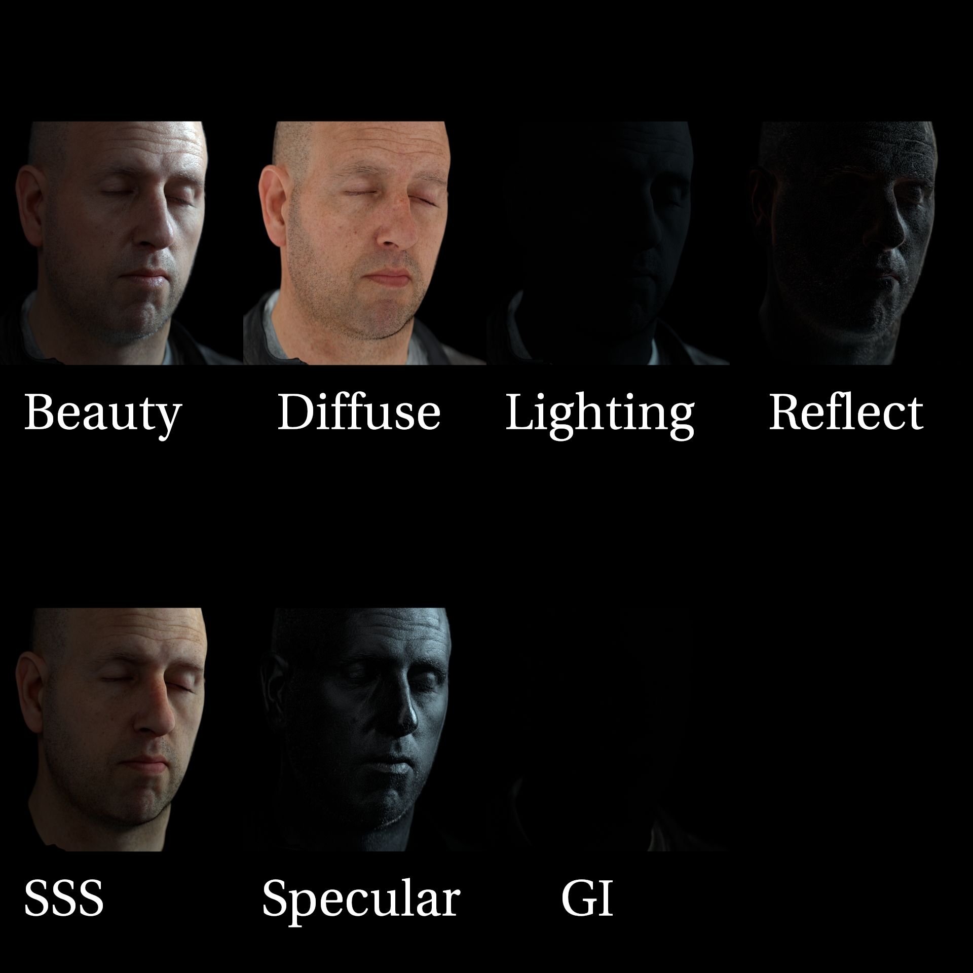
When you render make sure you use AOVs so you can tweak reflections/specular/sss/etc separetely.
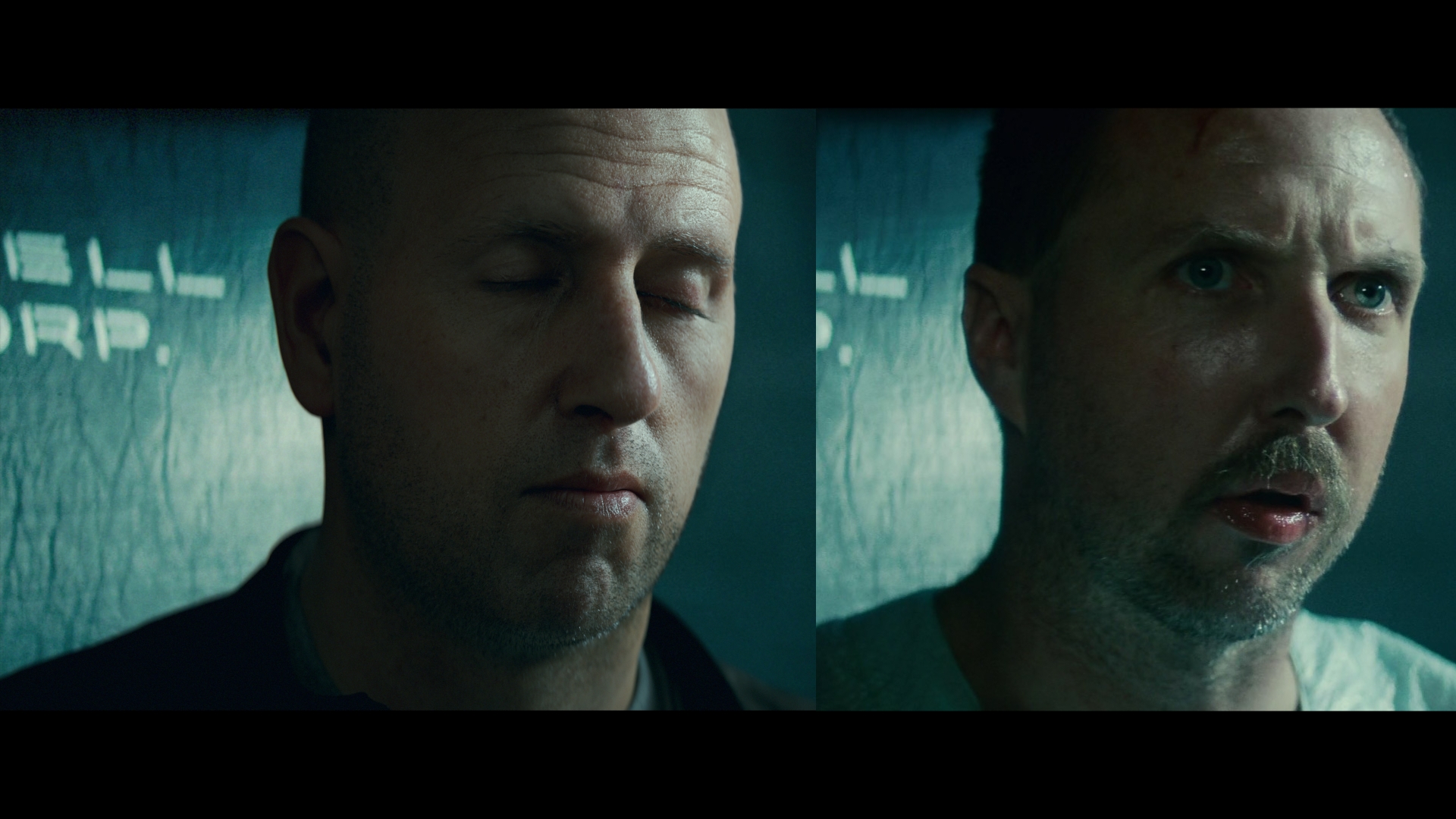
I put my render on top of the plate and then side by side with the reference. Now I can see how close my render got and what I need to change in order to get the same grade.
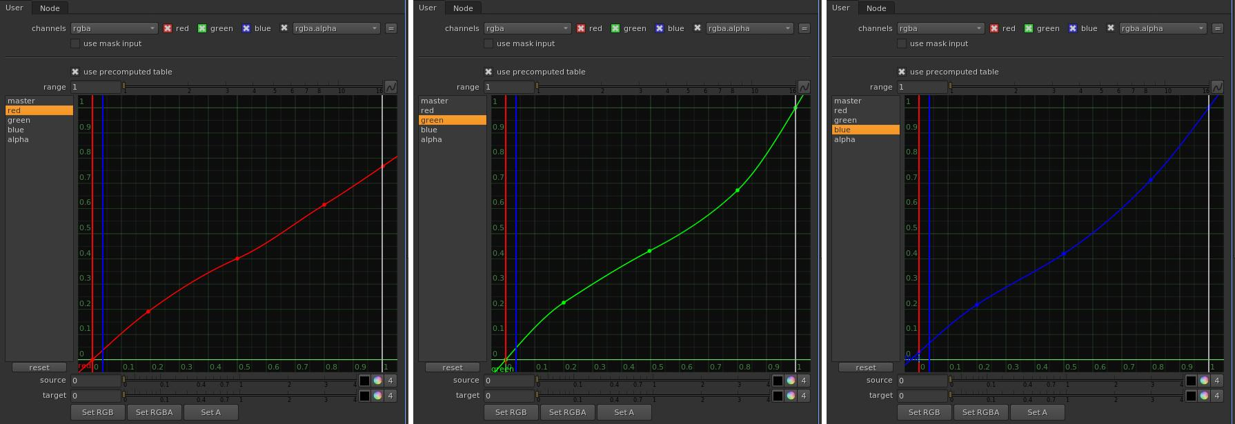
First I make an overall contrast grade. When using Nuke I use the "colorLookup" node which gives you curves to control both the overall and each RGB channel. A little trick you can use is to convert your image to log colorspace before the grade node with a "log2lin" node. This will give you better control over the color curves. Then you convert it back to linear colorspace with the "log2lin" node reversed after.
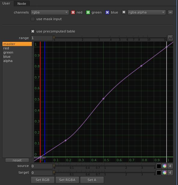
After the overall grade feels fine I move over to analysing each color channel seperately.
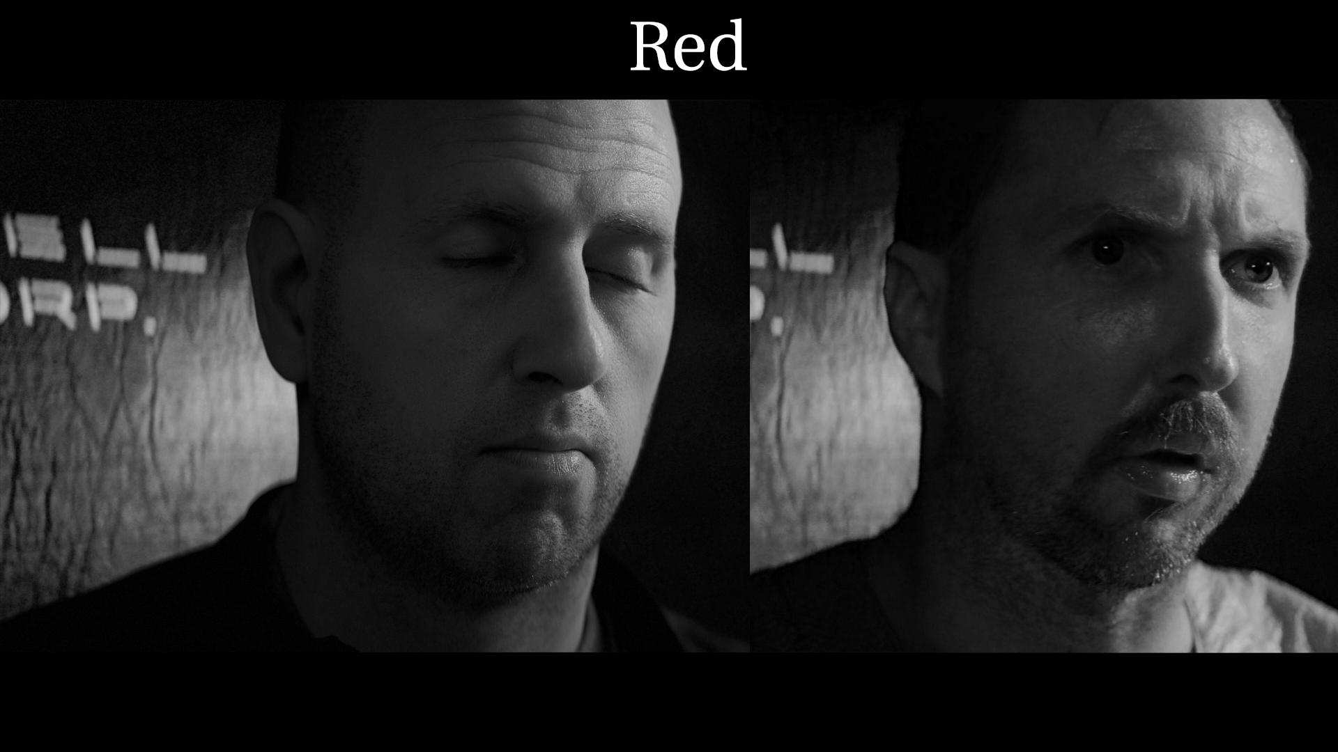
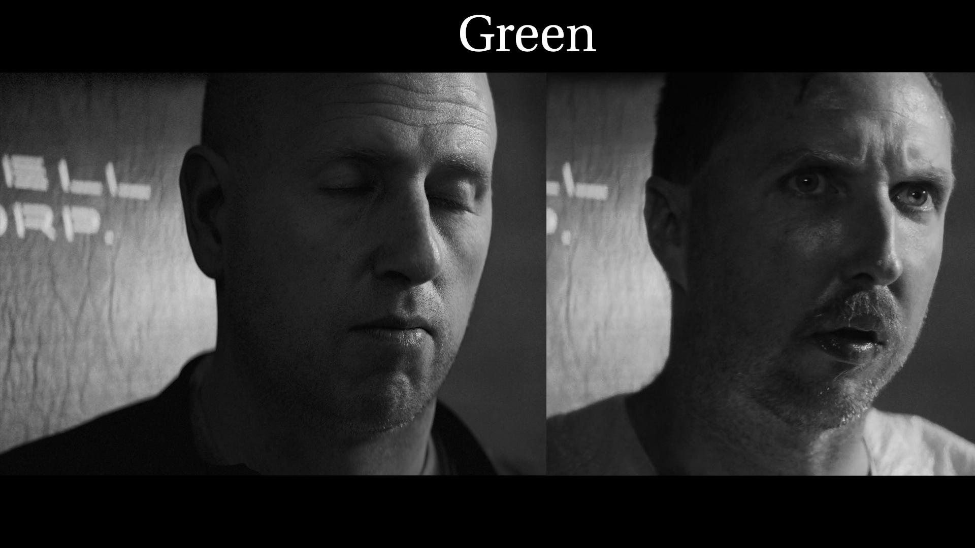
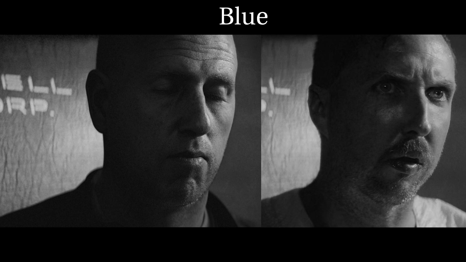
By looking at each channel separately I can tweak the color curves for each channel until I have as close a match as possible. I'm mostly looking at the contrast and light values of the skin at first.
For filmgrades there is usually some softclipping going on, that brings the highlights down while still maintaining the same intensity of the other parts of your picture. In nuke you have a "softClip" node that can do this. You can also do it manually with the curves.
In the grading process you will notice if your lighting needs tweaking. Maybe the colours or intensities need tweaking. If the changes you have to make to your grading are too dramatic you probably need to do some balance work on your lighting first.
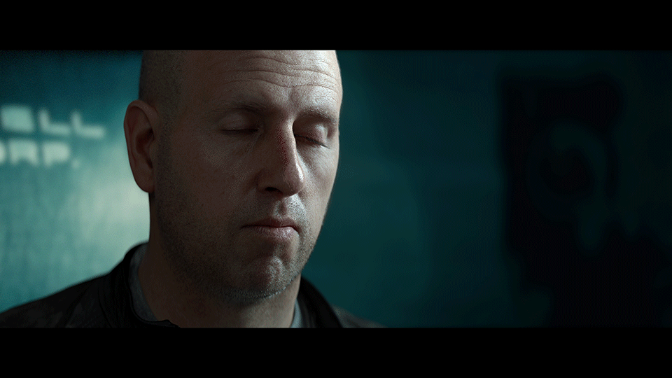
After our grading you should have an image that closely resembles our reference.
I also added some grain and lens distortion, I just added some random low values to the red channel and then add a bit more for green., and even more for the blue channel. Just low enough so it's not poping out in the final image.
Lastly I added a bit of vingetting, this effect actually happens in the camera. More in some than others. But you usually need a mask around the edges of the film that you darken.
I decided to crop the image in the end for it to work better for viewing. So now it's more like a portrait than a film frame.
Here is my final version of the image.
You can find me on instagram: https://www.instagram.com/johanvikstroem/
Or on artstation: https://www.artstation.com/jovi_se